
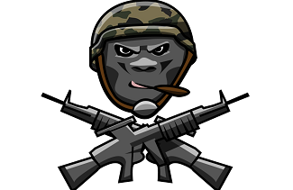
 It was a long process, but readers of the OIL have chosen a winner. Shane Maddox's and Anthony Wustenfeld's Oklahoma City Infantry ended up garnering 34% of the votes to beat Blake Campbell's Roughnecks (26%) in our "NFL in OKC" design contest.
Congratulations to the men. And thank you to everyone who submitted designs, shared the page, and voted in the poll. A special thank you goes to Uni-Watch, who linked to the contest multiple times. Click the image to see the complete Infantry submission. Shane and Anthony can now choose something from our online store as a prize. Let me know what you'd like by emailing me and I'll make that happen.
0 Comments
 Craig Priestley is the latest to submit a design for our Oklahoma City uniform contest. He said he didn't have a team name for his submission, but that it was inspired by the Oklahoma City flag. Does anyone want to take a shot at naming this team in the comments? 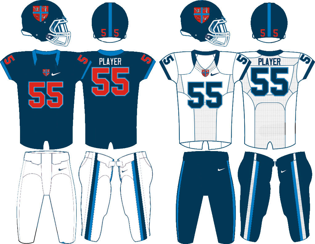 If you want to help create this hypothetical NFL team in Oklahoma City, send logo/uniform designs to OklahomIraqis@gmail.com. The deadline is March 15, and the winner may get something from our league store.
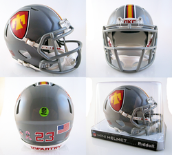
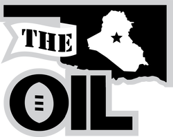
Thank you to Mr. Priestley and everyone else who has submitted designs so far. 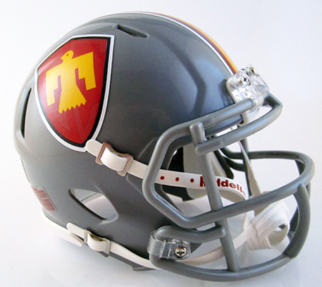 Wow. Shane Maddox and Anthony Wustenfeld responded in a big way to our call for design submissions for an Oklahoma City NFL team. As a reminder, the deadline for submissions in the contest is March 15, 2014. Shane owns T-Mac Sports, and he partnered with Anthony Wustenfield of Pro Line Designs to bring us the Oklahoma City Infantry. Here's what he had to say about his submission: "I had wanted to create a concept for quite some time now, and with my access to resources (being the owner of T Mac Sports), and the intrigue of an Oklahoma City football team, I figured the time was now. I enlisted the help of Anthony Wuestenfeld with Pro Line Designs. He ownes an Oklahoma based company, who more recently brought NFL attention to OKC via a photoshopped “OKC Seahawks” t-shirt. Between my resources and design ability, and Anthony’s knowledge of Oklahoma, we were the perfect team. 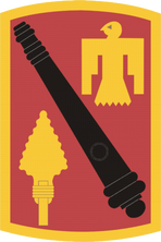 1st Bn 158 Field Artillery patch 1st Bn 158 Field Artillery patch Wow. I am impressed. The OIL started in Baghdad as all the managers were members of the Oklahoma Army National Guard's 1st Bn 158th Field Artillery regiment. We were field artillery though, not infantry. Still, we are proud of the 45th Infantry Division. The 45th Field Artillery Brigade began as the field artillery element of the 45th Infantry. We also proudly wear the T-Bird on our shoulder. So, kudos to this team of designers for incorporating the 45th. Now, to the uniforms.
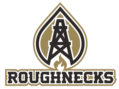
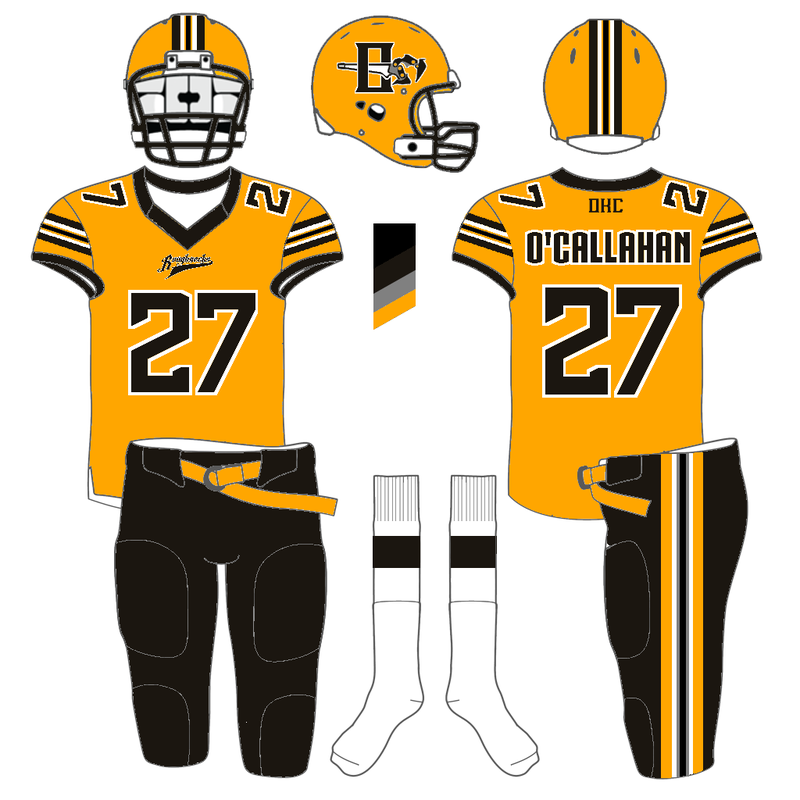
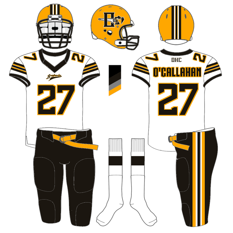
Andrew Seagraves previously submitted a design for the hypothetical Oklahoma City NFL team design contest. His original design centered on Rattlers as a name. We liked the overall look of the design but wanted to see what he could do with Roughnecks. He sent an updated version using Roughneck: "Here goes the rebrand of the Rattlers into the Roughnecks. I incorporated a soot color and black into the scheme. For the helmet symbol I tried to make my own Manual tongs (I hand drew it) and the font I used for the word mark is 35 dollars for a commercial license (I found out) and since this is for a competition I believe it is okay. If i were to make money off of it then I'd have to purchase it. I also hand drew one and outlined it in paint.net and I wish I had illustrator to make it better. 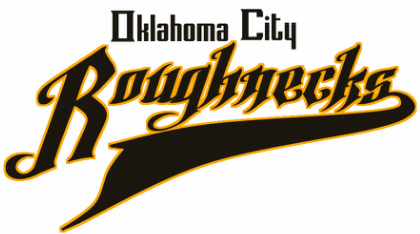
Skott Schoonover previously submitted a design for the hypothetical Oklahoma City NFL team design contest. His original design included a slanting oil derrick made up of the letters 'R' and 'n,' which was unique and clever. But the slant was a little too much. He sent an updated version without the slant: "Hi, I updated my roughnecks design. I took away the slant to the logo and the numbers. I like it a lot better. I think the logo could be a bit more legible as the 'R' and 'n,' but I'll work on that. Hope you like the updates." 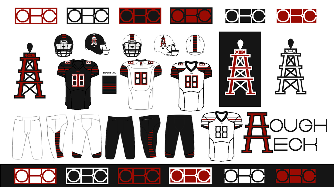
I like the numbers without the slant more. And the overall look of the oil derrick logo looks better, but I did like the 'R' and 'n.' I think Skott can find some happy medium between his first submission and this one that would be perfect.
Thanks for the extra work, Skott. If you want to submit your own design, send them to OklahomIraqis@gmail.com. The deadline for entries is March 15. Here are the other entries:
The winner may get something from our league store. 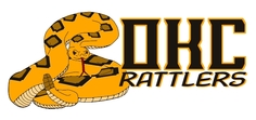 It is a good thing I check my SPAM folder. Otherwise, Andrew Seagraves's submission for his Oklahoma City Rattlers would have never made it to okiraqi.org. Mr. Seagraves found our contest on Uni-Watch.com, so thanks again to that site. They've referred over 10,000 unique visitors to our site. We appreciate it. Our original post asking for logo submissions is: NFL in OKC? Here is what Seagraves had to say about his design: "Dear fellas, It's not Roughnecks but I like the design and concept. Here's his full entry:
Skott Schoonover sent in his Roughnecks design this week. According to him, he completed it entirely using Microsoft Paint, so bravo Mr. Schoonover! It looks too good to be done with that platform. 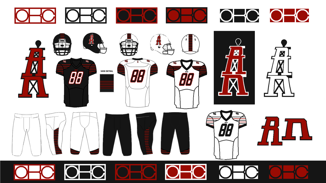 Here's what Schnoover had to say about his submission:
Keith Good designs logos at his Web site: keithisgood.com, and tweets from @keithisgood. He sent in this Roughnecks design, and we appreciate his work. 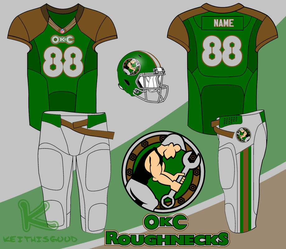 Here's what Mr. Good had to say about his design:
 SportsLogos.net SportsLogos.net Our latest design submission for an Oklahoma City NFL team comes from George Burnett. Mr. Burnett found our contest on SportsLogos.net. He named the franchise the Spirits: "Here is something that I did last year around this time. There are several images to build the case and they will be in order. Burnett did a good job letting his images speak for themselves. Overall, I like the concept. He also broke the cardinal rule by not naming the team Roughnecks. But he presents something that would be uniquely Oklahoma. The colors match well with the state flag, the Native American influence is noticeable without being offensive, and the name is not used in any other professional sports league. Because he did such a thorough job explaining his concept through his images, I will just post those with little comment. 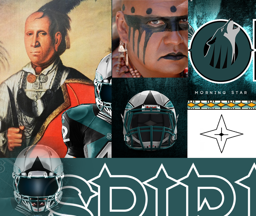 I like that the Native American influence is based on genuine examples of that culture and not a caricature of the people that Oklahoma was named for (Oklahoma is a Choctaw word meaning "red people"). I should note that this looks genuine and respectful to me: a lily-white male with zero percent Native American blood. I can't speak for Native Americans, so I'd be interested in hearing other opinions on the design from that aspect.
|


For other amounts,
use the Donate button above 
Click for team mugs, hoodies, decals, and much more.

March 2023
All
|


 RSS Feed
The OklahomIraqis League
|
|