
|
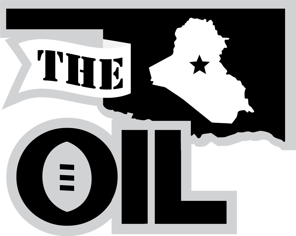
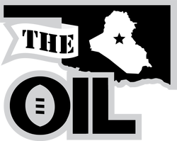
OKLAHOMA CITY — 2020 marks 15 years since the 1st Battalion 158th Field Artillery regiment deployed to Iraq on the SECFOR mission; it is also the 15th season of the OIL. To commemorate the occasion, the OIL Tuesday unveiled a new logo to be worn for the 2020 season. 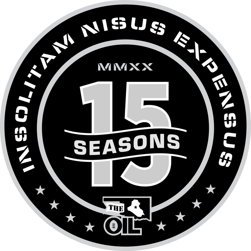 OIL 15th Season Commemorative Logo The 15th season logo draws on the league's heritage by taking the form of a challenge coin, using stenciled font, and displaying the 1st Battalion 158th Field Artillery unit motto — Unusual Efforts Expended — in Latin. Of course, the logo incorporates the now-familiar OIL logo that has been around since 2015, and the color scheme mirrors that of our flagship logo. The OIL logo has changed quite a bit since the website was first launched In March 2010. Back then, the commissioner's design skills consisted of finding a photograph of a football and superimposing text and a crude Iraq-inside-Oklahoma image on top of it. When the league ordered its first trophy from SculptureAlley.net, it was told the logo was simultaneously too simple to look good yet too complex for their engraver to replicate. Their art department designed a cleaner, more professional logo, which the OIL used until 2015. As the 10th anniversary approached, the logo was simplified once again, resulting in the current iteration. 
0 Comments
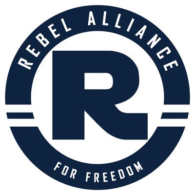
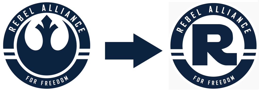 Old logo, left, new logo, right SHAWNEE — After being unable to use his previous logo in his team store due to copyright claims by LucasFilms, Rebel Alliance manager Don Roe has updated his team logo.
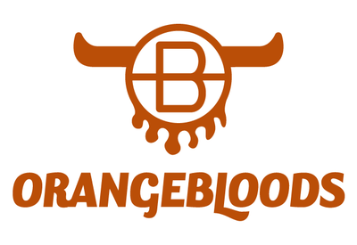
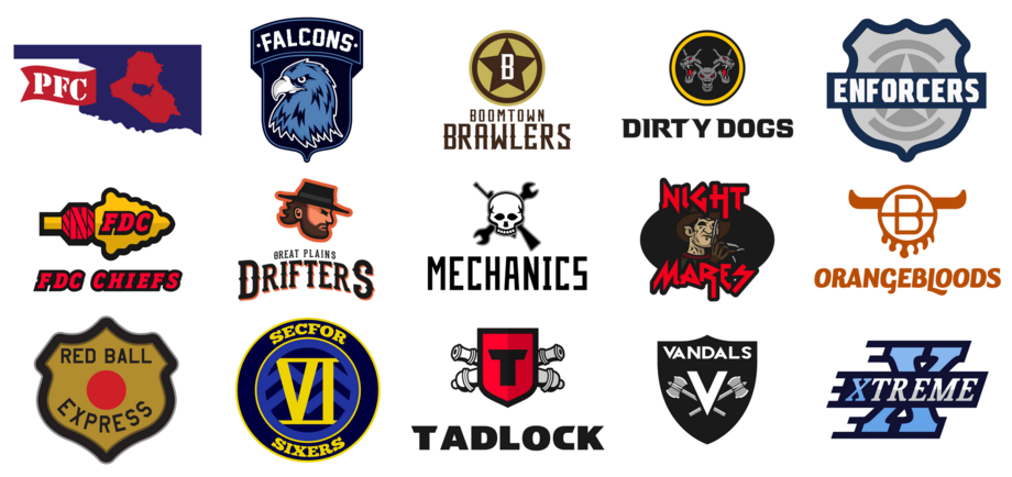 Recent addition Kevin Hodge unveiled his Red Ball Express today. The name is based off the famed Army unit that supplied the Allies during WWII. Hodge will compete in the PFC in 2016 and his team's branding complete's the newest conference's branding efforts. 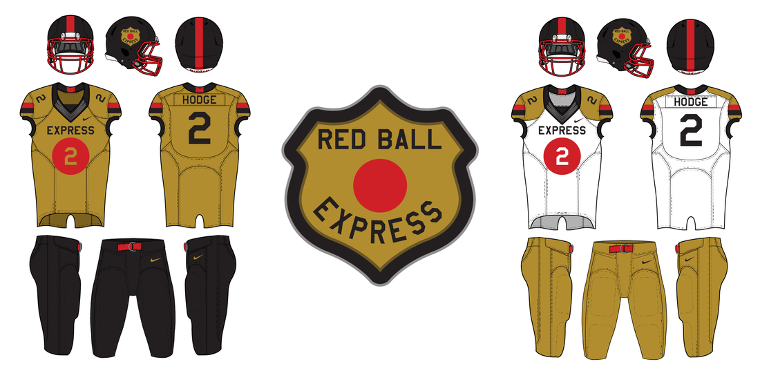 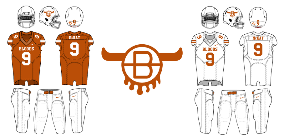 PFC manager Randy McKay remains a Texas fan despite all logic and reason. Therefore, he has based his fantasy football team on the Longhorns' look. The logo is supposed to look like a branding iron with 'O' and 'B' along with longhorns and blood. It was designed by Michael Taylor.
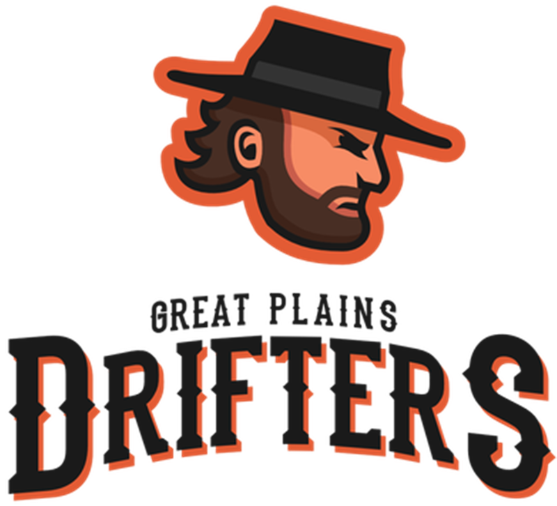
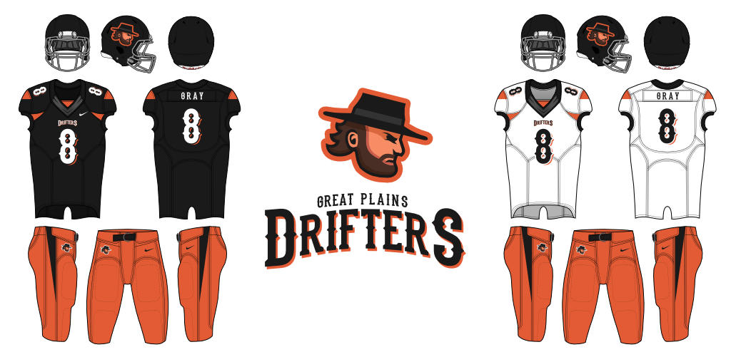 Aaron Gray's Great Plains Drifters finally have a logo and uniforms. They're based on the old High Plains Drifter movie. Gray chose number eight because his son was born in 2008.
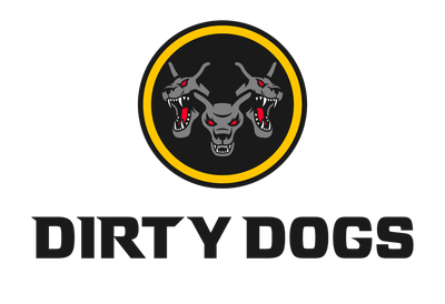
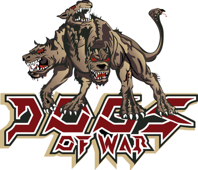
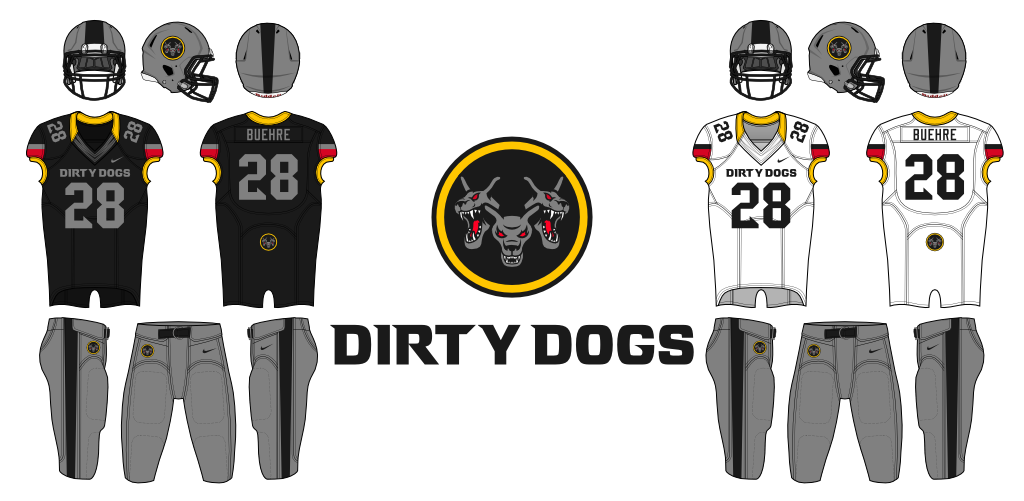 PFC Commissioner Scott Buehre unveiled the Dirty Dogs logo and uniforms Tuesday morning. With the unveiling, we are one team closer to decking out the entire PFC. Thanks to Michael Taylor for the design work.
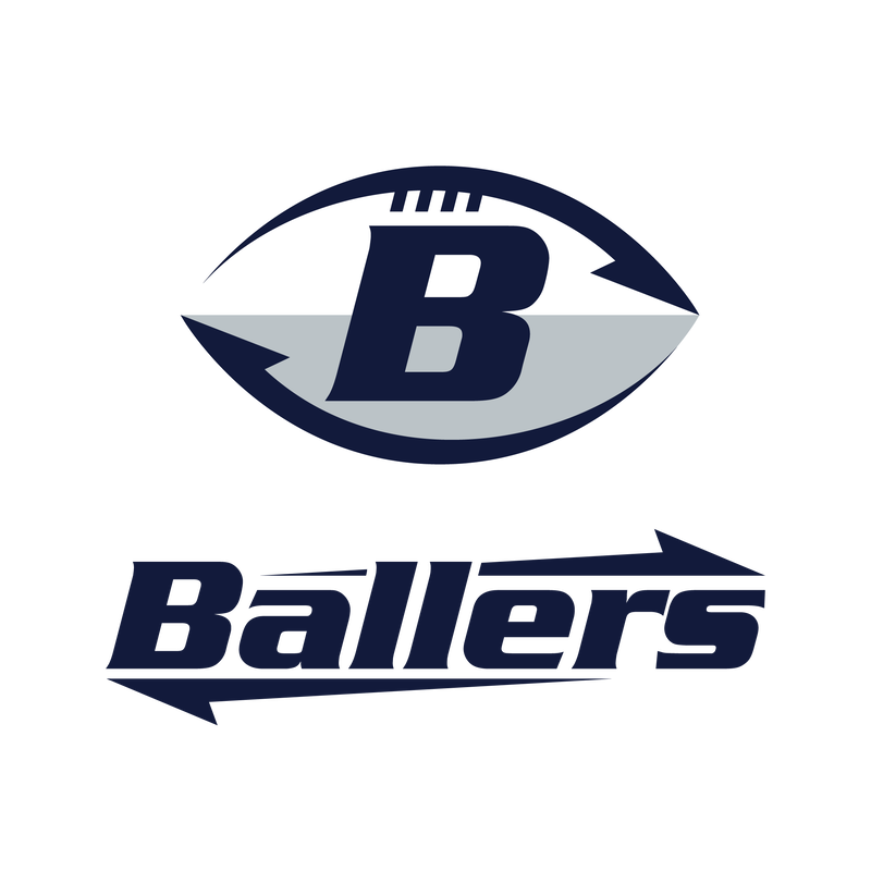
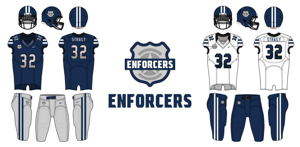 PFC manager Bill Straily released the logo and uniforms for his Enforcers franchise just in time for the regular season. The Enforcers' colors are navy and silver and are inspired by Straily's career in law enforcement.
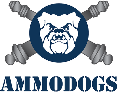
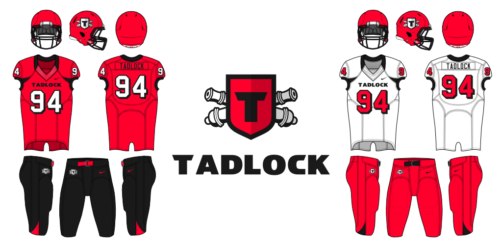 As the newest OIL conference grows, new franchises are being designed. PFC manager Derrick Tadlock was in the 158 on the 2008 Ramadi mission with Jessen, Zerger, Schuster, and Roe, among others. He's based his franchise's identity on the one thing no one can ever take from him: his name. The Tadlock franchise was designed by Michael Taylor and includes the Field Artillery's crossed cannons behind a single shield.
The OIL is proud to announce updated logos across the league. First is a special 10-year anniversary logo for the league. It is based on Breakfast Supply Co.'s streamlined version of the original OIL logo. Hector of Breakfast Supply Co. also designed the Liberty Bowl logo and streamlined the logos for the OIL's three conferences.
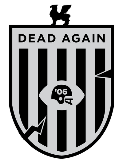
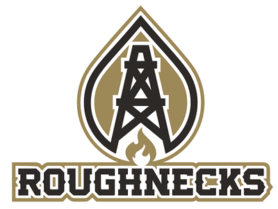
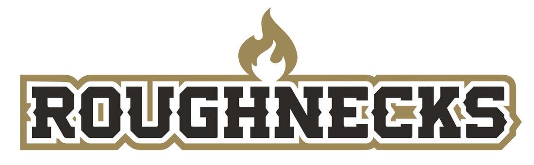 Roughnecks word mark 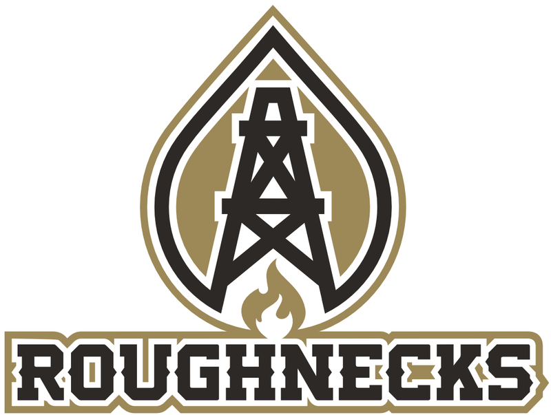 Primary logo Primary logo Yancy Baldwin joined the OIL in 2011, although he was on the original Iraq mission with the rest of the OIL members and competed in the DBFA's MGL before that. Since he joined the OIL, his franchise has gone by Reapers. But, with the recent re-brand of Dead Again, it became clear the two franchises were too closely-linked: they shared a common theme (death) and a common color scheme (Raiders-esque silver and black). OIL commissioner Cliburn asked Baldwin if he'd be willing to re-brand his franchise as Roughnecks, and he agreed. Roughnecks makes sense. Baldwin, like so many Oklahomans, makes his living in the oil and gas industry. The commissioner posted an entire article about why, should an NFL team ever move to Oklahoma City, it should be named Roughnecks. In this case, we decided on a color scheme of old gold and black. Oil is black gold, after all. And no one else in the OIL uses that color scheme. The result is a fantastic look that will stand the test of time. Gone are the silver and black uniforms Baldwin tolerated more than he liked. The new logo is a black oil derrick set against the golden sky at dusk . . . an iconic image in oil country. The shape surrounding the oil derrick symbolizes both the flare of a natural gas well and a drop of crude oil, and below the derrick is another natural gas flare. 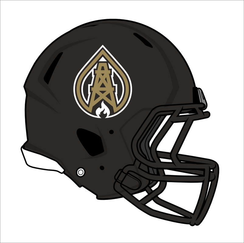 Home helmet Home helmet The primary helmet is black like the night sky. Set against the helmet's dark background, the flame at the base of the logo represents the flares on the Oklahoma horizon that signify, no matter the time of night, roughnecks are working hard to ensure we have energy. The jerseys feature "arms" on the chest to represent the arms of oil rigs that continuously pump oil from the ground of Oklahoma and beyond. The oil derrick logo is proudly displayed on each sleeve, and "ROUGHNECKS" is displayed across the front. The pants striping on each uniform matches its respective helmet. The alternate uniform has "BLACKGOLD" printed inside the collar. It features the black logo on the black helmet with no striping. The numbers are black with gold trim. 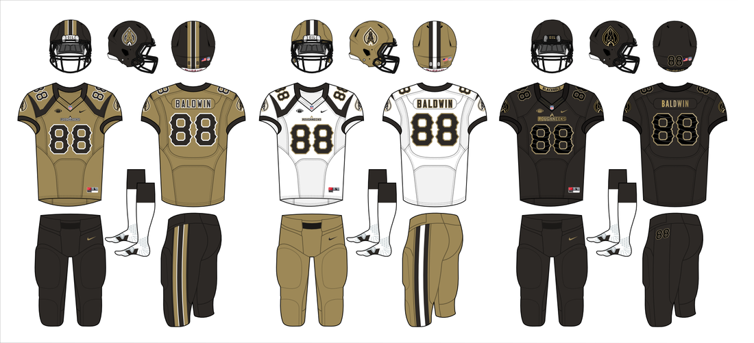 Home, Away, Alternate Primary logo featuring oil drop, oil derrick, and natural gas flare. |


For other amounts,
use the Donate button above 
Click for team mugs, hoodies, decals, and much more.

March 2023
All
|


 RSS Feed
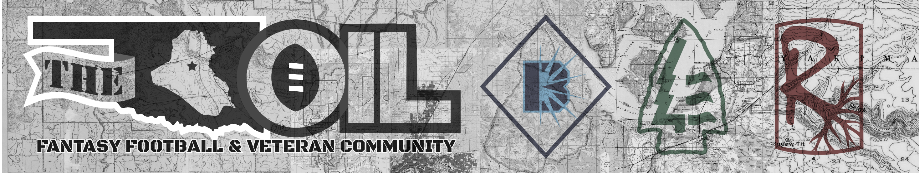
The OklahomIraqis League
|
|