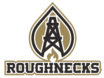
 Primary logo Primary logo Yancy Baldwin joined the OIL in 2011, although he was on the original Iraq mission with the rest of the OIL members and competed in the DBFA's MGL before that. Since he joined the OIL, his franchise has gone by Reapers. But, with the recent re-brand of Dead Again, it became clear the two franchises were too closely-linked: they shared a common theme (death) and a common color scheme (Raiders-esque silver and black). OIL commissioner Cliburn asked Baldwin if he'd be willing to re-brand his franchise as Roughnecks, and he agreed. Roughnecks makes sense. Baldwin, like so many Oklahomans, makes his living in the oil and gas industry. The commissioner posted an entire article about why, should an NFL team ever move to Oklahoma City, it should be named Roughnecks. In this case, we decided on a color scheme of old gold and black. Oil is black gold, after all. And no one else in the OIL uses that color scheme. The result is a fantastic look that will stand the test of time. Gone are the silver and black uniforms Baldwin tolerated more than he liked. The new logo is a black oil derrick set against the golden sky at dusk . . . an iconic image in oil country. The shape surrounding the oil derrick symbolizes both the flare of a natural gas well and a drop of crude oil, and below the derrick is another natural gas flare.  Home helmet Home helmet The primary helmet is black like the night sky. Set against the helmet's dark background, the flame at the base of the logo represents the flares on the Oklahoma horizon that signify, no matter the time of night, roughnecks are working hard to ensure we have energy. The jerseys feature "arms" on the chest to represent the arms of oil rigs that continuously pump oil from the ground of Oklahoma and beyond. The oil derrick logo is proudly displayed on each sleeve, and "ROUGHNECKS" is displayed across the front. The pants striping on each uniform matches its respective helmet. The alternate uniform has "BLACKGOLD" printed inside the collar. It features the black logo on the black helmet with no striping. The numbers are black with gold trim.
1 Comment
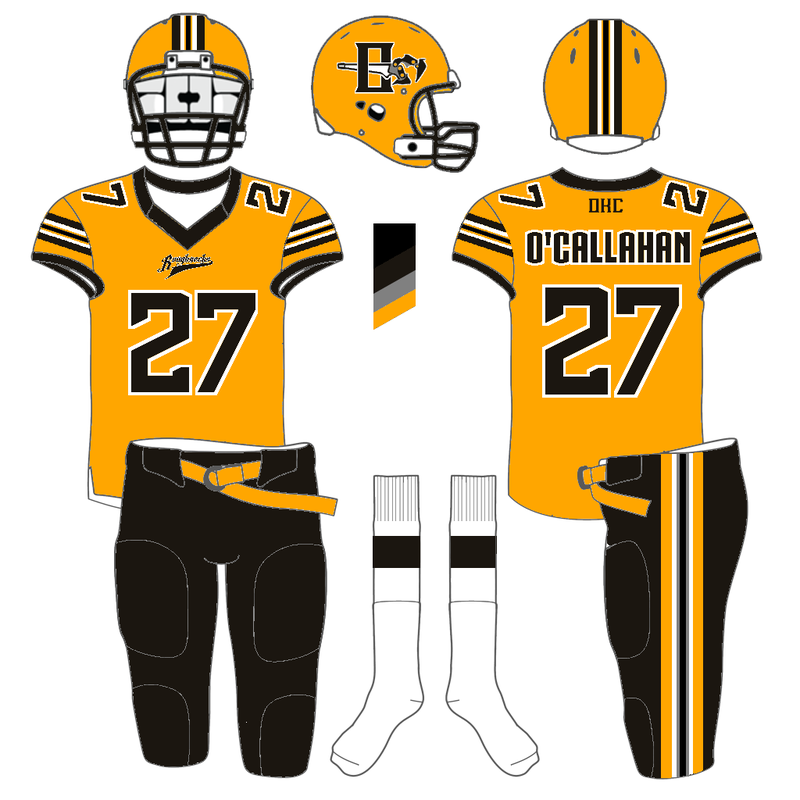
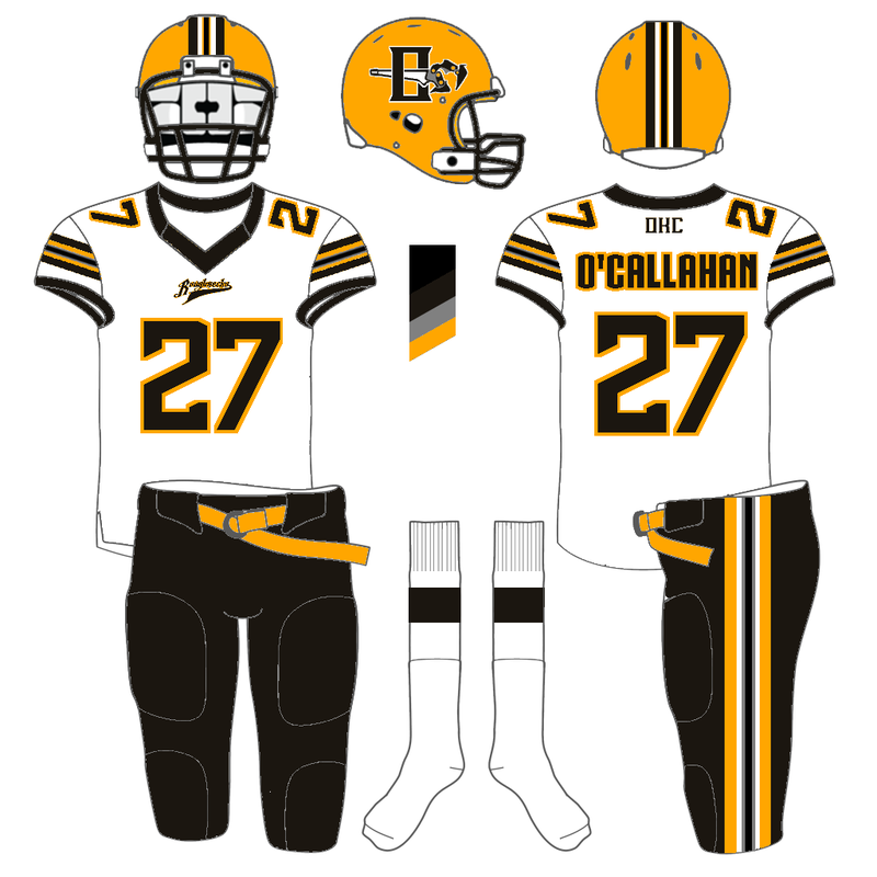
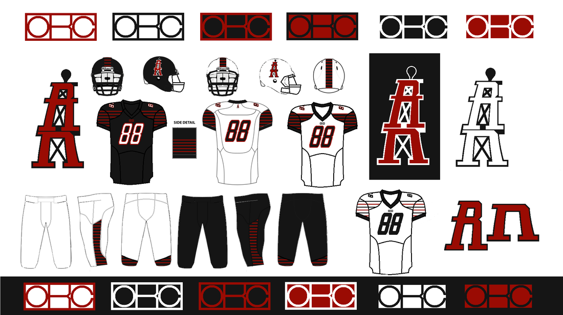
Andrew Seagraves previously submitted a design for the hypothetical Oklahoma City NFL team design contest. His original design centered on Rattlers as a name. We liked the overall look of the design but wanted to see what he could do with Roughnecks. He sent an updated version using Roughneck: "Here goes the rebrand of the Rattlers into the Roughnecks. I incorporated a soot color and black into the scheme. For the helmet symbol I tried to make my own Manual tongs (I hand drew it) and the font I used for the word mark is 35 dollars for a commercial license (I found out) and since this is for a competition I believe it is okay. If i were to make money off of it then I'd have to purchase it. I also hand drew one and outlined it in paint.net and I wish I had illustrator to make it better. Skott Schoonover previously submitted a design for the hypothetical Oklahoma City NFL team design contest. His original design included a slanting oil derrick made up of the letters 'R' and 'n,' which was unique and clever. But the slant was a little too much. He sent an updated version without the slant: "Hi, I updated my roughnecks design. I took away the slant to the logo and the numbers. I like it a lot better. I think the logo could be a bit more legible as the 'R' and 'n,' but I'll work on that. Hope you like the updates." I like the numbers without the slant more. And the overall look of the oil derrick logo looks better, but I did like the 'R' and 'n.' I think Skott can find some happy medium between his first submission and this one that would be perfect.
Thanks for the extra work, Skott. If you want to submit your own design, send them to [email protected]. The deadline for entries is March 15. Here are the other entries:
The winner may get something from our league store. The latest submission in our design contest for a hypothetical NFL team in Oklahoma City comes from Lennie Nelson. His Roughnecks design includes my favorite logo of the contest thus far. I do not love the turquoise, but I appreciate Mr. Nelson's reasoning: "My design is centered around traditional Native American shades of Again, I love the logo. It is simple and clever. The overall design looks very good. Thank you to Nelson for the work he put into this and for sending it to us. His design will be added into the contest update entry, which you can find here. Nelson did not provide a Web site or social media account, which is a shame because he's clearly talented.
To submit your own design, please email [email protected].  It is a good thing I check my SPAM folder. Otherwise, Andrew Seagraves's submission for his Oklahoma City Rattlers would have never made it to okiraqi.org. Mr. Seagraves found our contest on Uni-Watch.com, so thanks again to that site. They've referred over 10,000 unique visitors to our site. We appreciate it. Our original post asking for logo submissions is: NFL in OKC? Here is what Seagraves had to say about his design: "Dear fellas, It's not Roughnecks but I like the design and concept. Here's his full entry:
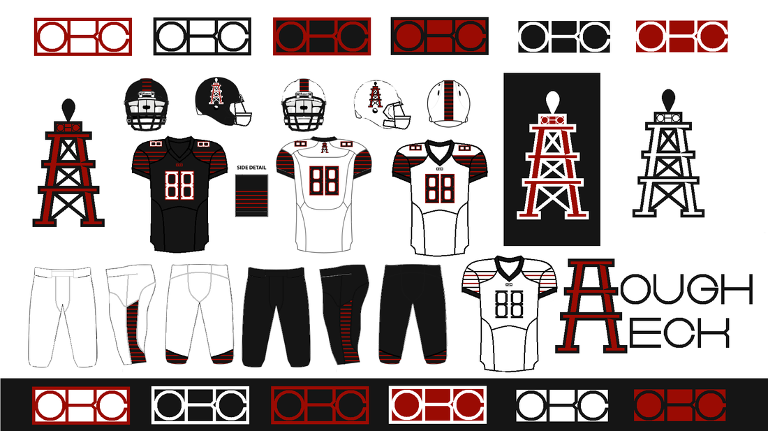
Skott Schoonover sent in his Roughnecks design this week. According to him, he completed it entirely using Microsoft Paint, so bravo Mr. Schoonover! It looks too good to be done with that platform. Here's what Schnoover had to say about his submission:
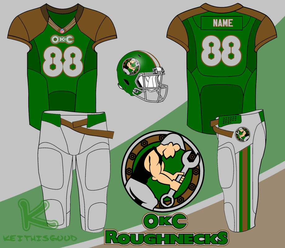
Keith Good designs logos at his Web site: keithisgood.com, and tweets from @keithisgood. He sent in this Roughnecks design, and we appreciate his work. Here's what Mr. Good had to say about his design:
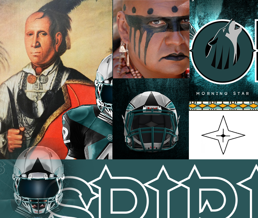
 Blake Campbell of Friday Night Design was the first to submit a Roughnecks design. It was very popular and the commissioner was a fan. But the clay color he used could be mistaken for something a little too close to Longhorn burnt orange. So, Mr. Campbell came back with a slightly different shade of clay that is closer to Oklahoma's red dirt than burnt orange:  SportsLogos.net SportsLogos.net Our latest design submission for an Oklahoma City NFL team comes from George Burnett. Mr. Burnett found our contest on SportsLogos.net. He named the franchise the Spirits: "Here is something that I did last year around this time. There are several images to build the case and they will be in order. Burnett did a good job letting his images speak for themselves. Overall, I like the concept. He also broke the cardinal rule by not naming the team Roughnecks. But he presents something that would be uniquely Oklahoma. The colors match well with the state flag, the Native American influence is noticeable without being offensive, and the name is not used in any other professional sports league. Because he did such a thorough job explaining his concept through his images, I will just post those with little comment. I like that the Native American influence is based on genuine examples of that culture and not a caricature of the people that Oklahoma was named for (Oklahoma is a Choctaw word meaning "red people"). I should note that this looks genuine and respectful to me: a lily-white male with zero percent Native American blood. I can't speak for Native Americans, so I'd be interested in hearing other opinions on the design from that aspect.
|
January 2024
All
|
The OklahomIraqis League
|
|














 RSS Feed
