 OkIraqi.org is proud to introduce a new feature: Ask the Arbitrator. Have a trade dispute? Do you wonder if the offer you've gotten is fair? Fill out the form and await your reply.
0 Comments
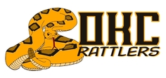 It is a good thing I check my SPAM folder. Otherwise, Andrew Seagraves's submission for his Oklahoma City Rattlers would have never made it to okiraqi.org. Mr. Seagraves found our contest on Uni-Watch.com, so thanks again to that site. They've referred over 10,000 unique visitors to our site. We appreciate it. Our original post asking for logo submissions is: NFL in OKC? Here is what Seagraves had to say about his design: "Dear fellas, It's not Roughnecks but I like the design and concept. Here's his full entry:
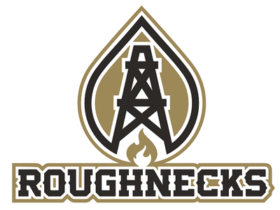
Skott Schoonover sent in his Roughnecks design this week. According to him, he completed it entirely using Microsoft Paint, so bravo Mr. Schoonover! It looks too good to be done with that platform. Here's what Schnoover had to say about his submission:
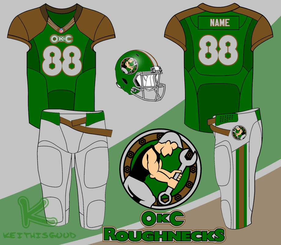
Keith Good designs logos at his Web site: keithisgood.com, and tweets from @keithisgood. He sent in this Roughnecks design, and we appreciate his work. Here's what Mr. Good had to say about his design:
 Blake Campbell of Friday Night Design was the first to submit a Roughnecks design. It was very popular and the commissioner was a fan. But the clay color he used could be mistaken for something a little too close to Longhorn burnt orange. So, Mr. Campbell came back with a slightly different shade of clay that is closer to Oklahoma's red dirt than burnt orange:  The Commissioner is a big fan of The Big Lead's Roundup posts each morning. If you only visit one page each morning for sports and pop culture, the Roundup should be it. The Big Lead is a blog owned by USA Today that mainly covers sports but also touches on everything from politics to pop culture. Today it linked to our oral history of the Hangovers/Arrogant Americans rivalry.
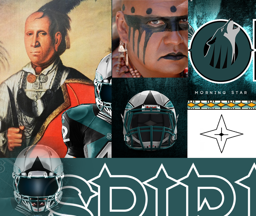
 SportsLogos.net SportsLogos.net Our latest design submission for an Oklahoma City NFL team comes from George Burnett. Mr. Burnett found our contest on SportsLogos.net. He named the franchise the Spirits: "Here is something that I did last year around this time. There are several images to build the case and they will be in order. Burnett did a good job letting his images speak for themselves. Overall, I like the concept. He also broke the cardinal rule by not naming the team Roughnecks. But he presents something that would be uniquely Oklahoma. The colors match well with the state flag, the Native American influence is noticeable without being offensive, and the name is not used in any other professional sports league. Because he did such a thorough job explaining his concept through his images, I will just post those with little comment. I like that the Native American influence is based on genuine examples of that culture and not a caricature of the people that Oklahoma was named for (Oklahoma is a Choctaw word meaning "red people"). I should note that this looks genuine and respectful to me: a lily-white male with zero percent Native American blood. I can't speak for Native Americans, so I'd be interested in hearing other opinions on the design from that aspect.
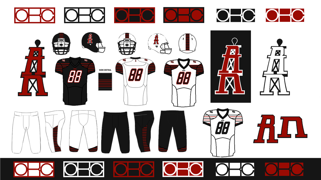
 Click to enlarge Click to enlarge We asked for logo designs for a hypothetical Oklahoma City NFL team. And, after 12,000 unique visitors over three days, we received our first Roughnecks design. It came from Blake Campbell, who saw our contest link on OperationSports.com. Mr. Campbell owns and runs Friday Night Design. His Web site is still a work in progress, but he has some great work he plans to display under the Fantasy tab. But Campbell had his reservations about Roughnecks. It's understandable for anyone who is not from oil country. Campbell worked through his apprehension though: "I must admit, I initially felt the task of branding an NFL team on men in the oilfield was a daunting one. But the more time I spent pondering the idea, the quicker my imagination began to run wild. I hope you and your readers will enjoy the design that I've put together. Let me explain my design. I love the idea. My only criticism is that the clay color looks a little close to the burnt orange used by the University of Texas. The Longhorns are not very popular here. I shared this concern with Campbell, and he agreed to modify the clay color to more accurately represent the "red dirt" that is famous in Oklahoma. But I love the overall design, so I'm posting the submission anyway. Back to Campbell's design though: HelmetCampbell's helmet design is clean and simple.
 This is the proof of the title plate on the OIL2's trophy. I look forward to seeing the finished product and following the league to see who is the first to win it.  Click to enlarge. Click to enlarge. After Uni-Watch linked to our logo submission post again, our site traffic went through the roof. By 2100 CST, over 5,000 unique visitors read our site. And we received our second design submission. David Firestone also broke the first rule of the contest (by not naming the team the Roughnecks), but that's just fine. We're happy to have another submission. Mr. Firestone chose the name Crazy Eights: "I created an Oklahoma City design called the Crazy Eights. The theory behind that is that Oklahoma is the 8th largest city in the US by area, and the 8 is a graceful and simple design. The white and silver color scheme is based on the Oklahoma Wranglers, as they were the last pro football team to play in Oklahoma City. I couldn't choose between red over silver, or silver over red, so I went with silver over red on the right side, and red over silver on the left." Thanks to Mr. Firestone for his submission. Love it? Hate it? Tell us in the comments. And don't forget to share the contest page on social media. Send your own submissions to [email protected]. |
January 2024
All
|
The OklahomIraqis League
|
|


















 RSS Feed
